Creating digital products can be a very complex process. Even if many use cases and patterns repeat, each product is unique and will challenge you to walk on unknown paths. To keep the focus it´s important to have a detailed idea of what you are building and for whom. And frankly this idea shouldn´t be only in your head. Collaborate closely with your colleagues and clients which means spreading your idea, receiving feedback and adapting it throughout the entire production phase.
To ease your life while producing you should find the right tools and processes for each job. During the last years working as an UX Designer I learned several techniques which improved my everyday work significantly. Let me introduce you to two of them.
User Stories – The Starting Point of a Project
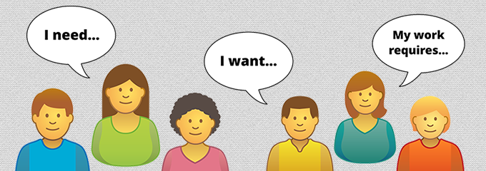
The most important person to focus on while building a product is the user. He is the one with a problem or task and expects it to be solved. In other words if a user has no problem or does not expect a solution, he would never get in touch with a certain product or service. But the worst case is if a user has a serious problem, expects it to be solved and in the end it´s not the solution. As you see, better be good in listening.
At VUCX we write so called user stories for our interactive and web products to understand the user´s needs in depth. A user story is a short description (not more than 2-3 sentences) of a problem or intention from the point of view and in the words of a user. It can be written by anyone who has knowlegde on a topic. This can be a real user or a UX professional who has gathered information, e.g. by interviews or questionaires.
Each user story contains a user role, a purpose and a reason. It could sound like this:
„As a public user I want to read about the most recent news on Company XYZ without navigating to save time and avoid distraction.“
In this case the user does not want to login nor he wants to navigate further down a website structure to read news. A solution could be to offer news teasers on the homepage out of a blog which is on a deeper navigational level. Now the user can decide which news article is of interest and worth taking a closer look at. Other solutions could be to deliver the news via RSS or by e-mail as a newsletter.
You could say without a user story I would have done exactly the same because I know my job. But when it comes to more complex decisions this technique reveals it´s pure bliss. By breaking down a difficult problem to a set of simple user stories it starts to appear less difficult and interactions between things can be spotted more easily. Additionally user stories can be understood by everyone, even if the reader has a conceptual and technical background or not.
It´s always a hard job to understand the users needs and to align all team members to a certain idea. User stories are a big improvement on that. You should definately try it out yourself!
Wireframes – Blueprinting on Steroids
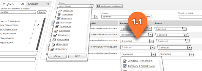
The most digital products come with a graphical user interface. Because both sides, man and machine act on the same layer it´s a good place to start inventing new features. For recording and playing around with ideas, discussing, internal presentational purposes and testing we use wireframes at VUCX. A wireframe, also known as a page schematic or screen blueprint, is a visual guide that represents the skeletal framework of a digital product´s user interface .1
Wireframes can be simple or rather complex and may come in different visual flavours depending on the taste of the creator and the needs of the team making use of them. I personally prefer hi fi wireframes over the lo fi sketchlike versions. The ambassadors of the sketch like flavours love to point out that customers and colleagues will never start discussing about style and design while watching at them. This is supposed to lead to a stronger focus on the functionalities. To be honest, I don´t agree. What I found is that discussions about functionalities and screens just stay with the obvious while working with lo fi wireframes. Deeper thoughts about the essence of a problem and details in interaction rarely come up.
Hi fi wireframes are more detailed and closer to a real design. I admit this might lead to discussing about peanuts and distract from the big picture. But it lies in the hands of the creator to point out the important elements by hightlighting them visually. I chose coloured and uniquely numbered 2D pins pointing on the elements of interest. Each number refers to a annotation providing further explainations.
Traditionally most design deliverables should be ready before coding a single line. Hi fi wireframes can help to make this static project phase paradigm more flexible. In some cases the pixel perfect design phase can be skipped totally or at least start in parallel with the coding phase. In time-critical projects this could be your lifesafer.
Testing with users is very important to find out about improvements to a product. Most of the time this starts only in later project phases when a lot of coding and graphical design work is done. Extra work cycles and a loss in time and money are very common. Hi fi wireframes can help to avoid this. Because of their high amount of details users and clients need only little imagination to get an idea of how a product will work. With some simple tweaks hi fi wireframes can be turned into a paper based prototype which could serve as testing environment with real users in early project stages.
Wireframes in general help all stakeholders to better understand a project and it´s obstacles. But particularly testing with real users on wireframe based prototypes is very interesting. The efforts to do so are quite small and the outcome is invaluable.
References
1 Brown, Dan M. (2011). Communicating Design: Developing Web Site Documentation for Design and Planning (2nd ed.). New Riders Press. ISBN 978-0321712462.
Further Reading
User Story on Wikipedia
Website Wireframes on Wikipedia
The 20 best Wireframing Tools
10 Tips for Writing Good User Stories
18 Great Examples of Sketched UI Wireframes and Mockups
4 Things No One Told Me About High-Fidelity Wireframes


